Wednesday, October 29, 2008

Yelle!

You who may not know, as I didn't, Yelle is a French electronic pop band with a cute singer who is quite fashionable and out there. Many of her outfits contain the entire rainbow with additional flourescent splashes and perhaps a Mickey Mouse or smiley face applique. For that reason, I was inspired to add a muted piece to broaden the arsenal. I wanted the band name to stand out so I made it the only part that's in color and modern looking. For the rest, I hoped it would look like a very old faded photo...

Twilight Sleep Rorschach Test


This caused quite a stir in my band but we won't get into that. Suffice it to say Twilight Sleep is all me now and I'm so happy. This image was intended to be a sort of country seal/rorschach blot/stamp to use for our digital release on itunes that I could also use as a rubber stamp.

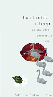
Twilight Sleep Fliers


These two fliers were done around the same time and seem to go together to me. There are the aforementioned swans as well as a pair of lips that were projected on a wall at the Magnet Club in Berlin. I love the way if you look closely, the lips have stickers and graffiti all over them from the filthy club wall. The flier above is clearly a peacock though a band member told me it looked like a turkey. Regardless, I liked the shape of it upside down cutting through the black and if it were a turkey, it would be a damn good looking one!

Cold War Kids Poster


This was my second poster assignment for Redbird/Goldenvoice. The picture below was taken on a little lake in Germany where my boy played at a festival. We snuck away for a sunset paddle boat ride and were followed around by a mass of beautiful swans. The swans in the distance are the same ones starring in the Cold War Kids poster (and a Twilight Sleep Poster as well). The funniest part about this serene picture is that outside of our frame to the left is an enormous tent from which a German techno-rock band is blaring and thousands of teenagers are swarming about drunk on Heineken.

C.S.S. Poster for Goldenvoice

This was the first poster I did for Redbird Management. Because CSS has a young audience, I got to go with some bright colors. I never quite accepted the fonts and struggled with them at the time. These were the only ones that seemed to work. I've made better friends with typography since then and have a new found obsession with lettering. Coming up will be a lot of studies of using text as the design.